Hello, Again
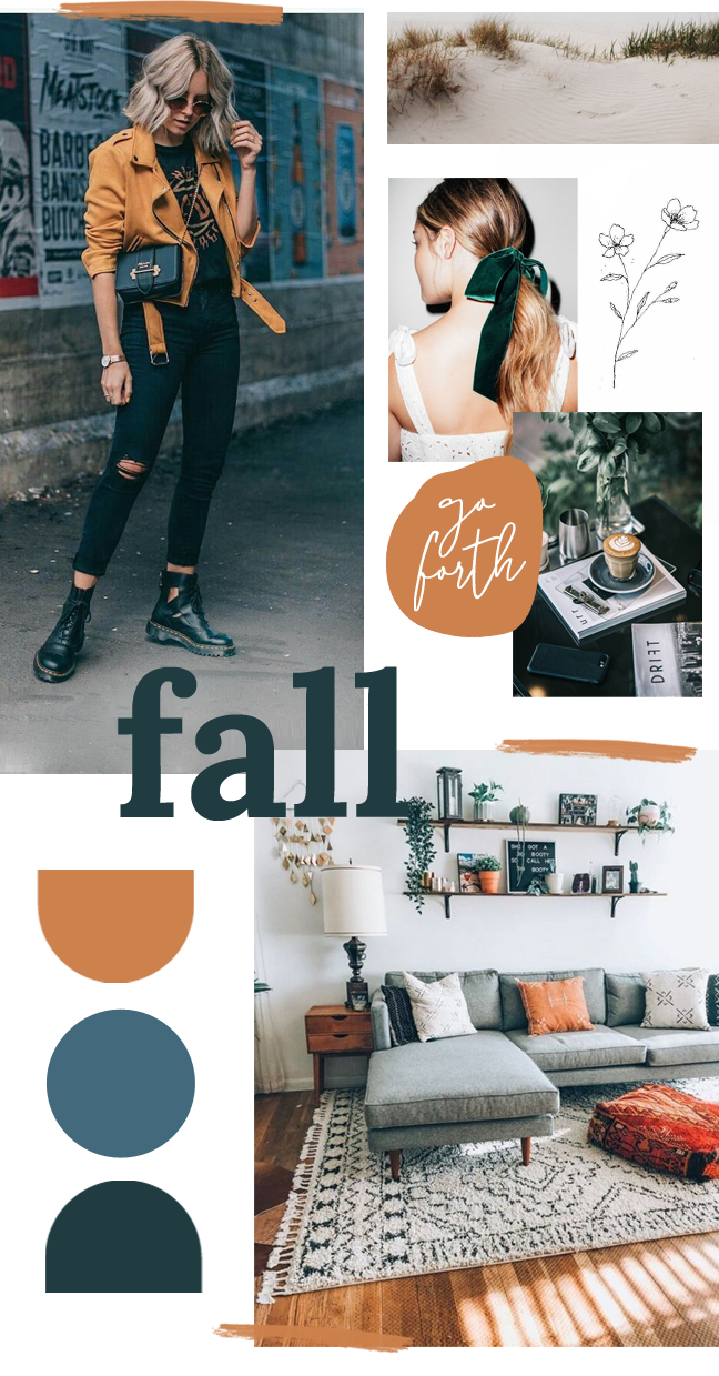
It’s been a ~hot minute~ since I’ve written or posted anything non outdoors related. The past few months have been pretty weird for me personally (I process a little of that here)but in the midst of that, it’s the time I’ve spent creating “just for fun” that has been uplifting. Hence the mood board. I’m just going to jump right in, ok? So. The realization that I needed to make a seasonal mood board came while watching the show Schitt’s Creek. I don’t know if that’s something I should admit. Perhaps I should instead say I had a spark of creative genius and was inspired to create this, but, either way. Here we are, talking about a TV show.
At one point in the episode I was watching, the character David says he couldn’t be in charge of decorations for a party because “I don’t have time to mood board a color scheme.” I felt that. There’s something extremely satisfying in the process of visually organizing your thoughts and inspirations. I mean, I heard this quote in the show and was like “Yes, David, I get it. I really do.” Thankfully, though, I do have time on my hands to mood board some color schemes, so here we go.

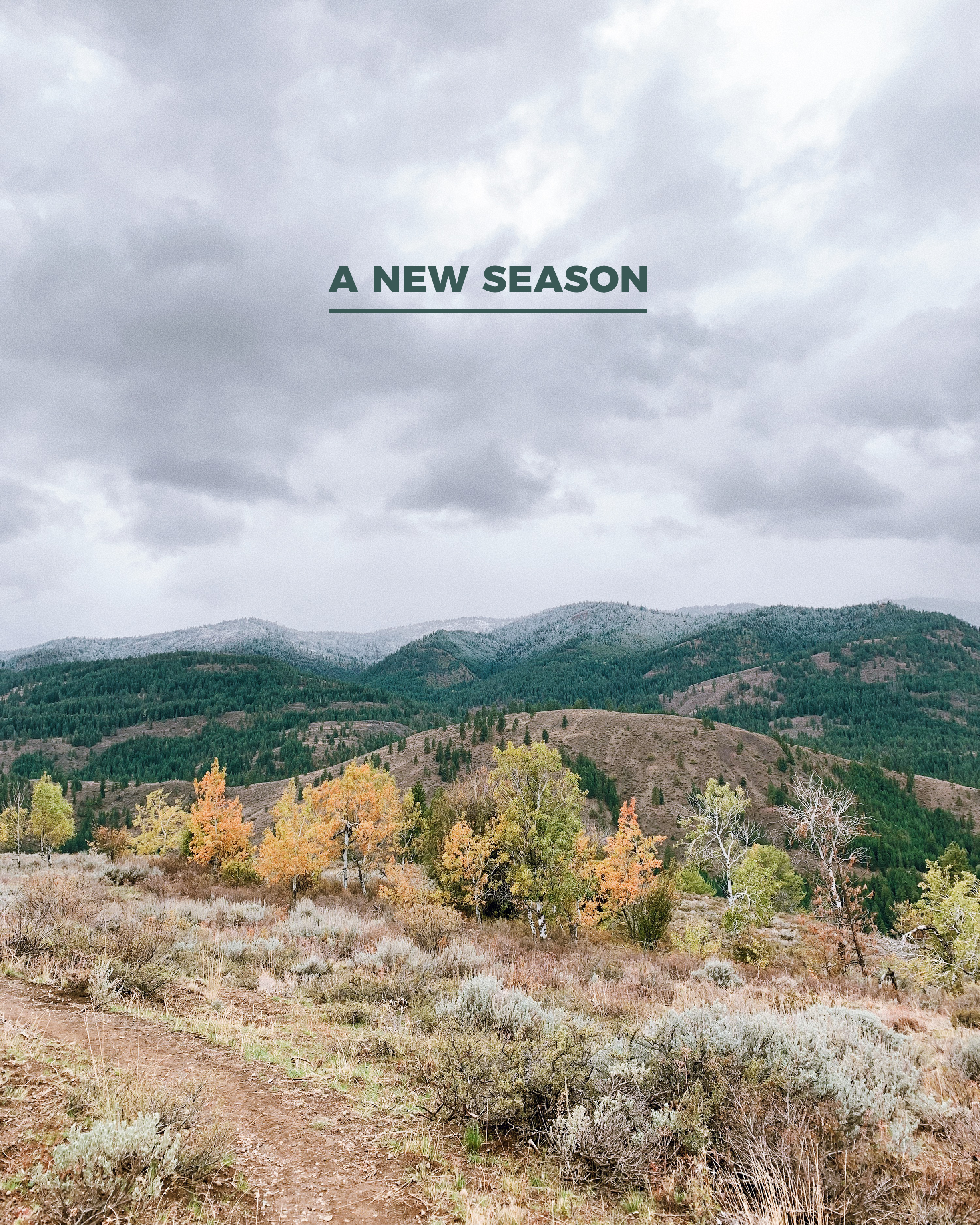
Welcoming In A New Season
Now that fall is well under way, I’ve been loving all the seasonal changes. Cooler weather, bursts of color popping up, the chance to pile on some layers, hibernating. Yes, please. Ask me how I’m feeling about all of these things come February when it’s been cold and dark and rainy for a few months and I’ll probably change my answer. BUT for now, I’m all in for welcoming the new season.
As for the how that translated to this mood board, I realized mid-creation that it played off of the one I made in January for the whole year. And, since I really loved that mood board, I’m not mad about it. Besides that, since slowly entering back into the design/style/regular every day world post Pacific Crest Trail, I’ve been noticing how much inspiration is being pulled from the 70’s. I mean, hello, even clogs are back in style?! It seems as though everything from typography to trending clothing and color seem to pull inspiration from the 70’s – even if it’s a loose inspiration. There’s rich, dark colors in combination with throwback shapes, along with interesting texture (hello velvet, never thought I’d care to see you again) and clean, bright spaces.
Go Forth
This doesn’t always happen intentionally, but it seems I end up with a guiding mantra for whichever season the mood board is created for. At this point I honestly can’t remember where I saw or heard “go forth”. Since the phrase showed up in my head, though, I’ve done a small watercoloring with it, stuck it on a post it note I can see daily, and now placed it lovingly into this season’s inspiration.
I think what I love about this mantra is that it feels full of hope. Regardless of how tough the past few months have been, it is still better to go forth and risk, and maybe fail, than it is to let disappointments keep me in routines of easy familiarity. I have to constantly remind myself of this. As the year begins to wind down, I want to embody this phrase. To me, it means ending the year well, moving forward even if it means taking teeny, tiny steps. Going forth can be obvious. Sometimes it can seem hardly noticeable. It can be a literal push forward or a change in mental or emotional perspective. Regardless, I hope to finish out these last few months of 2019 going forth bravely. How about you?
The Details
Images: street style, beach (unknown), velvet bow, line drawing, coffee, interior